Exploring ESG art: What can we learn from corporate photos?

ESG (Environmental, Social and Governance) disclosure standards require the production of an almost endless stream of corporate communications, principally in the form of written reports. These are mostly read only by investors, wonks, or other weirdos like myself, but they are also expressions made for the corporate community, reflecting its values back to itself. Because they are invariably made up of words, charts, and page after page of dry tables, almost every one contains some sort of imagery to spice up these otherwise dreary documents.
Corporate art gets a bad rap, and most deservedly so. Corporations, especially big ones, are not known for being avant-garde, the many layers of approval that material has to go through inevitably stamping out some of the more interesting or rougher edges. Most corporate communication (including visual communication) aspires to embody or project a sense of being competent, reassuring, in control of their sphere of action, and so on. The worst thing your corporate art could be is offensive – to possess too much like a sense of ‘taste’, of having 'something to say', or even possessing a style might exclude any who aren’t appealed to by that aesthetic cup of tea.
I have read a stupid amount of game industry ESG documents this past week for a project I’m working on (very exciting, more on which in a bit). If you read enough of these reports you get a sense for what the permissible styles of visual communication are in this very niche, very specific corner of corporate communications. The whole ESG exercise is, in a very real sense, about identifying and eliminating risks, and so it is with imagery chosen to go with the ESG reports. ESG art, as a subset of corporate art, is a genre, with tendencies and trends within it, mostly (but not all) deeply expected.
Probably the most typical example of ESG comms is the impeccable nature photograph. These are everywhere, and they are the go-to, standby option for just about everyone everywhere. Hell, I use them all the time, and across my own website. After all, who could be offended by an incredible, almost transparent rendering of a snow covered hillside, or a hiker deep in the forest, captured and revealed to us like a window on the natural world? You might as well get angry about the concept of infinity as such an image. It's like being upset by the presence of the moon. Microsoft is a master at this kind of image. In this one below it illustrates a table of contents for a section on Carbon Negative efforts, serving to connect corporate action with the enjoyment of, and perhaps a sense of wonder about, nature.
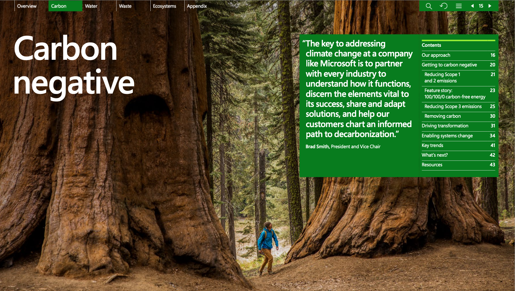
The figure in the landscape, utterly dwarfed by these majestic giants, cannot look anywhere else but directly up at them. In the same direction as his gaze – oh look, it's a quote from Brad Smith, President and Vice Chair, who gets to share in this reflected awe and attention. The high resolution and clarity of detail in the image – a technological artefact of the best imaging and post-processing technology available – also conveys the Microsoft mastery over the world itself. “Here is the true natural world” the image says. I am a window by onto it, and this image is more “real” than if we were standing there and looking at the same scene with our own eyes, which would no doubt be buffeted by the imperfections of lighting, wind, weather, time of day, etc. This kind of photography aspires to the universal perspective, stripping back any accidents of embodiment, of time and place.
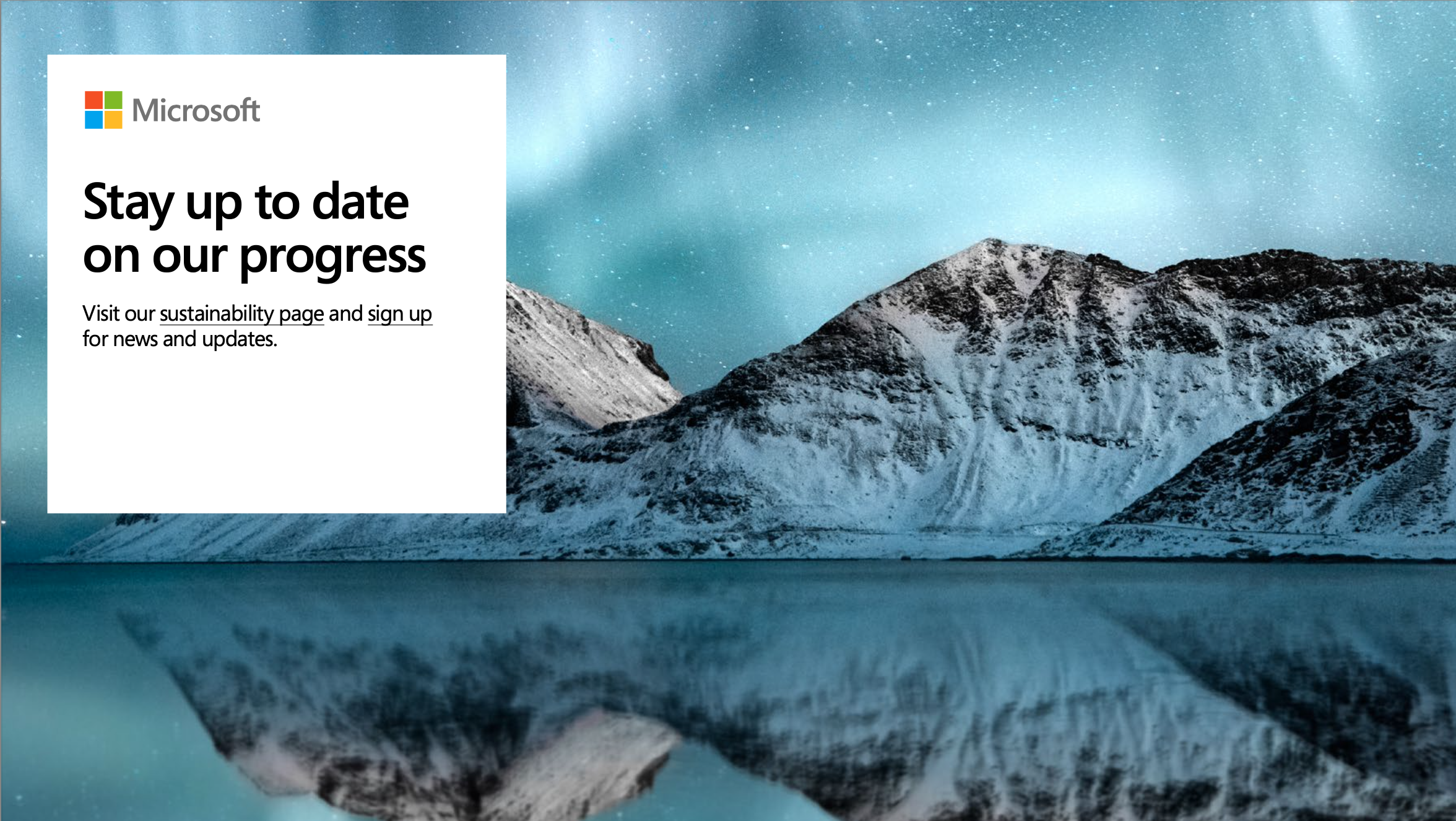
The same style of image, focussed instead on the super-wide angle landscape or the timelapse is just as common. The natural sublime revealed again by sharpness of the image, the perfection of the camera lens, enabled by the tripod and post-processing, capturing the wide open space ready and able to be filled with relevant environmental information. The final page of Microsoft’s 2021 ESG report punctuates the document with an image of a landscape sufficiently breathtaking as to be destination-worthy . “You’ve arrived at the end of the document… do you want to sign up to our newsletter?”
If the awe inspiring landscape shot is prominent, it’s matched perhaps only by images of the complete opposite type: the super-close, macro shot. Here’s one from Tencent’s ESG report, featuring a plant sprouting from the dirt, next to which is an LED lightbulb (complete with photoshopped glow, emanating from the wrong part of the bulb) and the words "Environmental Protection". The incongruousness of the two objects placed side-by-side is irrelevant.
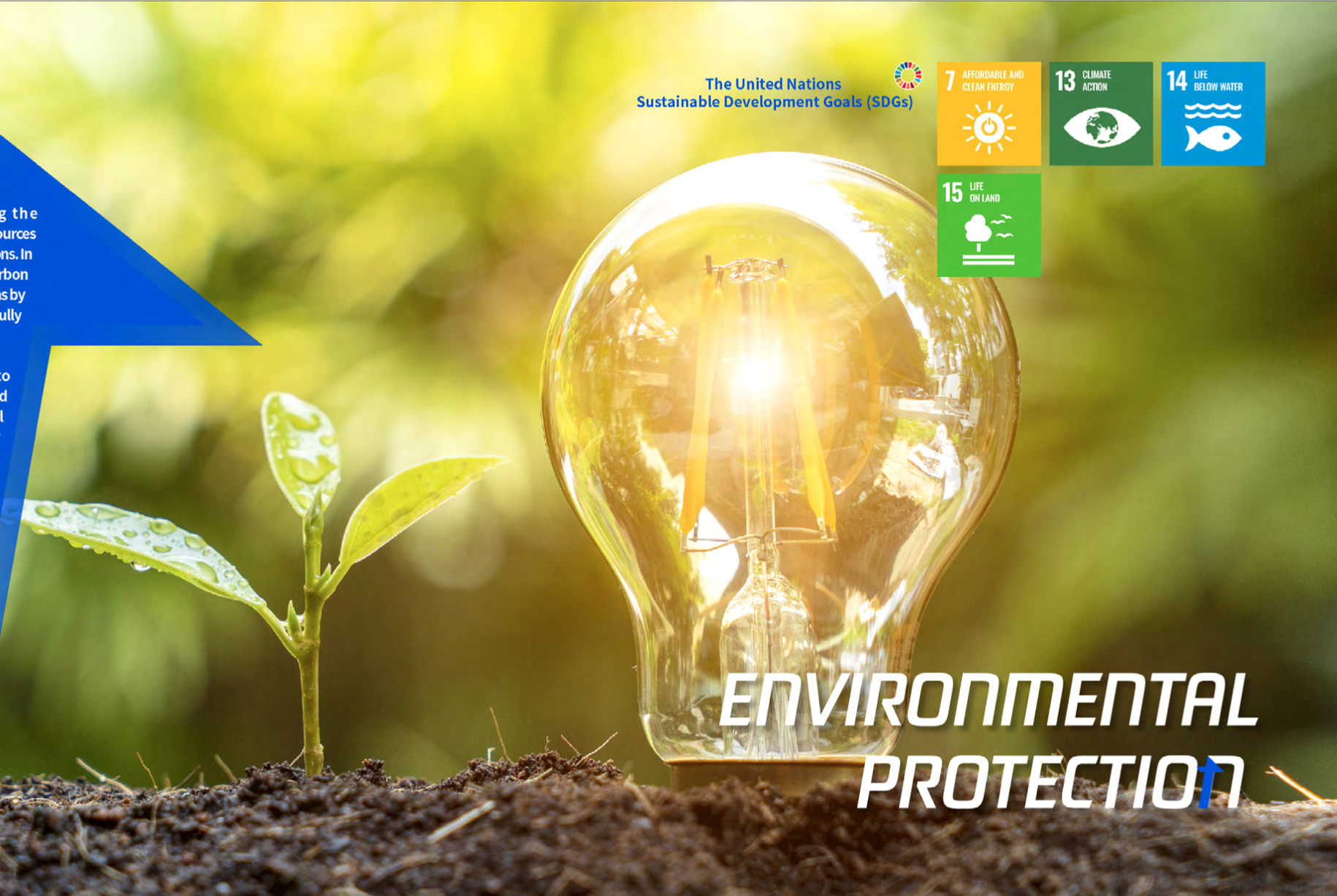
These images, so much more tightly focussed on objects follow a much more literal kind of visual grammar. The image says to us, literally: “here is new life or nature, and here is a familiar technology, the LED globe.” Most people (myself included) are skimming through these documents as quickly as possible, just trying to find a specific thing before their eyes glaze over, so this sort of image functions well enough, so long as we don’t slow down and really think about what we are seeing. Light bulbs don’t belong in dirt, and they don’t glow like that. Nevertheless, the association is made. The image is proof – these two things go together, the evidence is before your eyes.
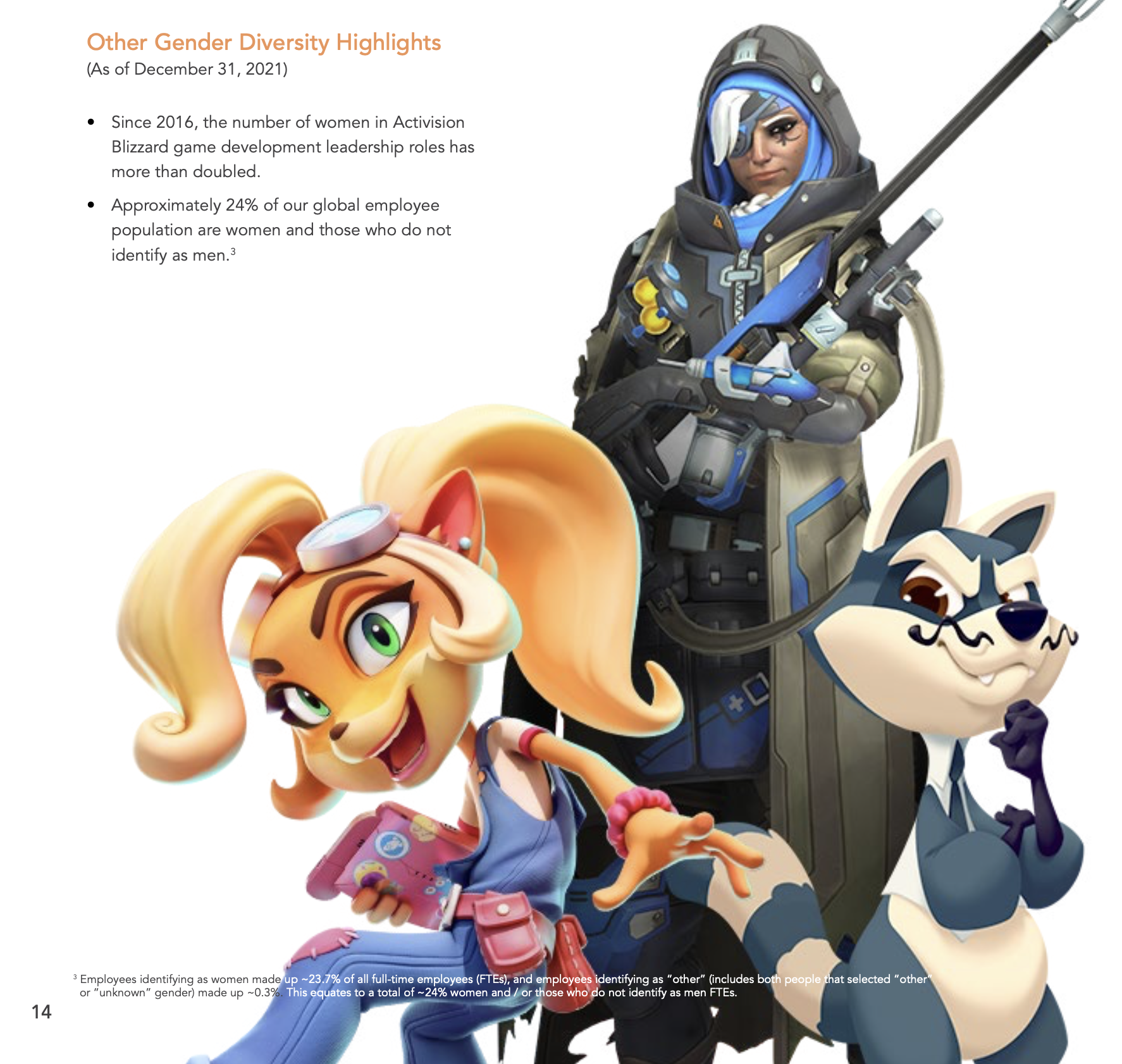
Games companies are in the business of making art, so it should be no surprise that art from games themselves turns up in ESG documents as well – though less often than you might expect. Activision Blizzard loves this so, so much, that I can't help but see it as a reflection of genuine pride in their creations, in their art and visual style, which is somewhat refreshing for being at least a bit different. Here’s the diversity of fictional characters being used to illustrate the diversity of their global workforce, a connection that… mostly works, but only if you don’t linger on the demographic reality of their workforce being 76% male.
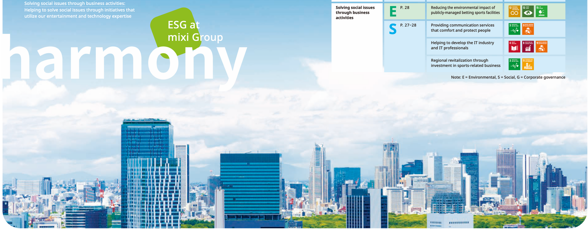
Another visual communication trend in these documents is to literalise the E S and G. Here’s Konami showing their efforts in each, under images of the environment, of hands united in a team, of powerful handshakes made by people in suits before a wireframe globe.
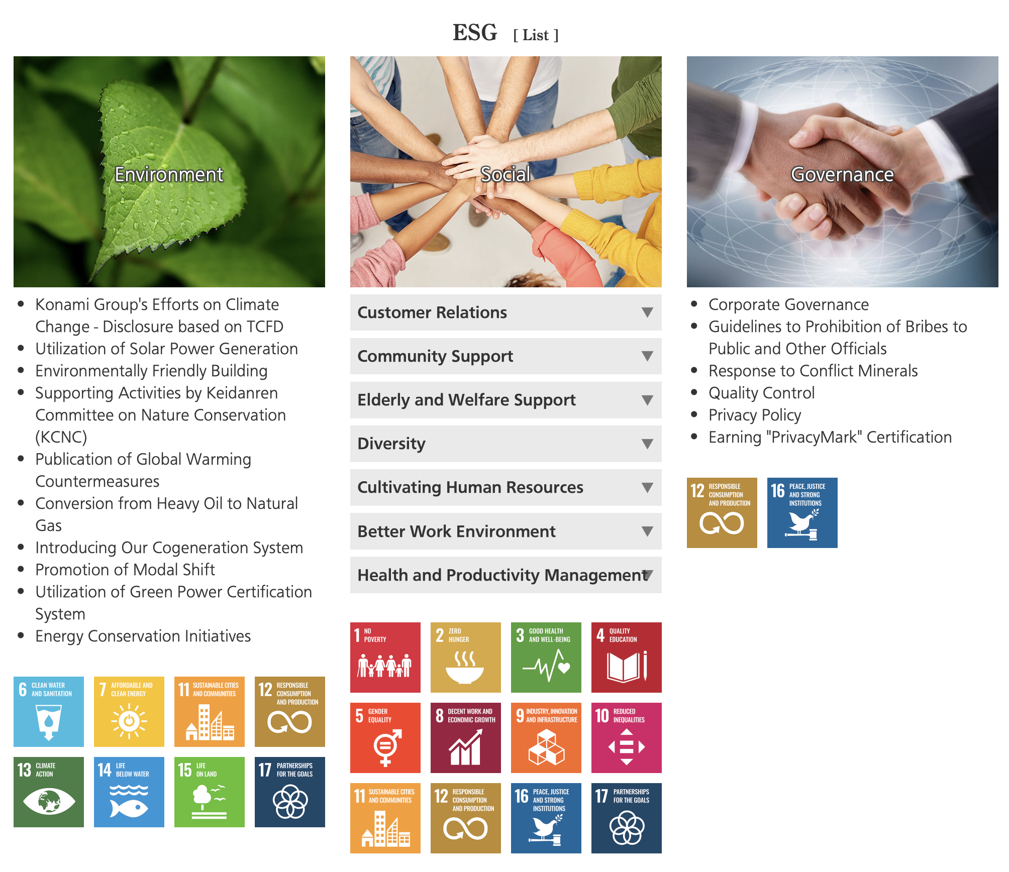
Accompanying each area is the colourful squares with icons, names and numbers drawn from the UN’s Sustainable Development Goals visual language. These are a colourful, yet somewhat noisy visual element when grouped together like this. Konami’s use of them here works because they are set apart somewhat, but they are used used more harmoniously (at least visually) in the Tencent image earlier, where more SDGs icons matched the colour palette a bit better. They blend into the background more there, for better or worse.
It’s also common in corporate comms to use photos of the people themselves, and it’s a good decision in most contexts. The people themselves can be the ones making the ESG decisions, or benefiting from them: here’s some happy rural agricultural workers from the Tencent report. The second guy is one of my favourites. Look how happy he is.
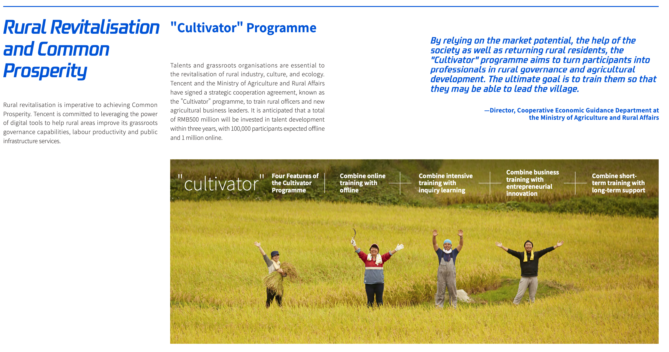

Pictures of people are great – especially if they are expressive or happy. Most people are at least interesting to look at if photographed well. Think about all thoseYouTube thumbnails that feature the YouTuber making a stupid expression. It’s the same impulse at the base of our attraction to such images – it's just a bit less deranged than clickbait. The instagram account ‘Climate Visuals’ has also shown how communicating climate change impacts are most effective when they show the people involved or affected. People like seeing people.
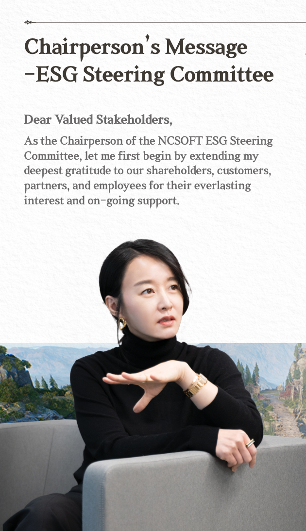
Photos of decisionmakers themselves can be quite humanising of the often sterile corporate atmosphere, putting a friendly face on an otherwise dry, sometimes quite serious issue. Here’s the NCSoft ESG head looking very considered, like she is explaining the latest efforts:
The Swedes though – they take the serious look to a whole new level. Here’s the Embracer Group CEO, followed by their new head of Sustainability, both looking very serious and thoughtful.


No one holds a candle to the MIXI Group CEO however.

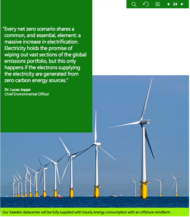
Another prominent visual trend we haven’t yet touched is the use of images of renewables. These are probably on-par with the exceptional nature photo for their ubiquity in ESG documents. Here’s Microsoft again, using an offshore wind farm picture to illustrate that a Swedish data centre will be powered by renewables.
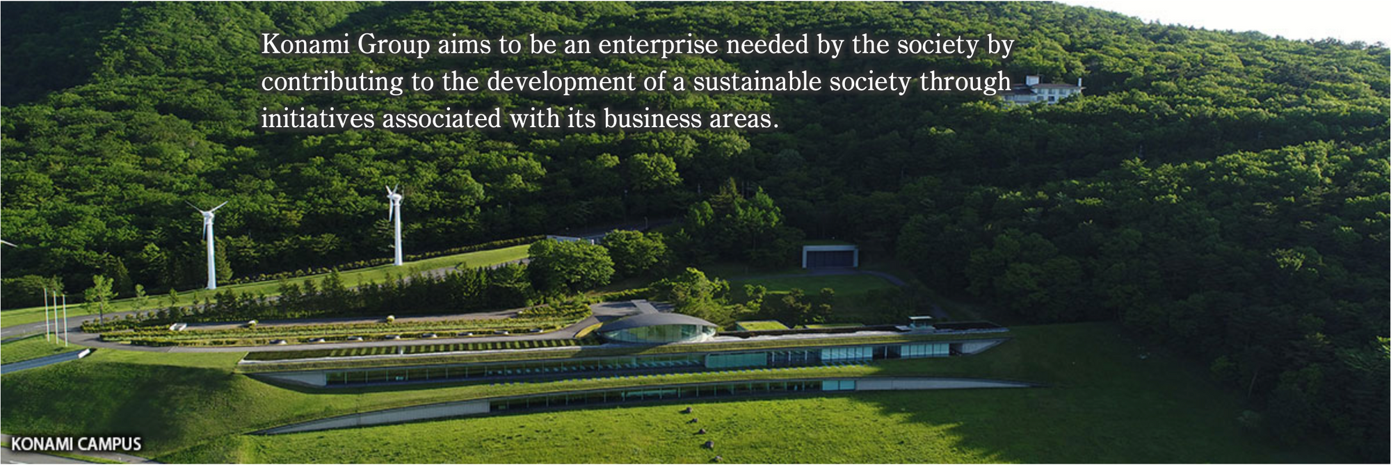
And here’s an image of Konami’s campus from their ESG website, complete with wind turbines and a lush forest behind them.
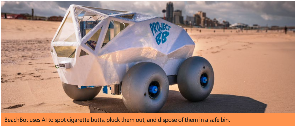
A variation on this similar theme of advanced technology in harmony with nature is the image of the tech prototype. It might be an energy saving device, a new kind of sustainable energy system, or a nature enhancing robot of some kind. BeachBot, featured in Microsoft’s report, identifies cigarette butts on the beach and collects them. Good job BeachBot.
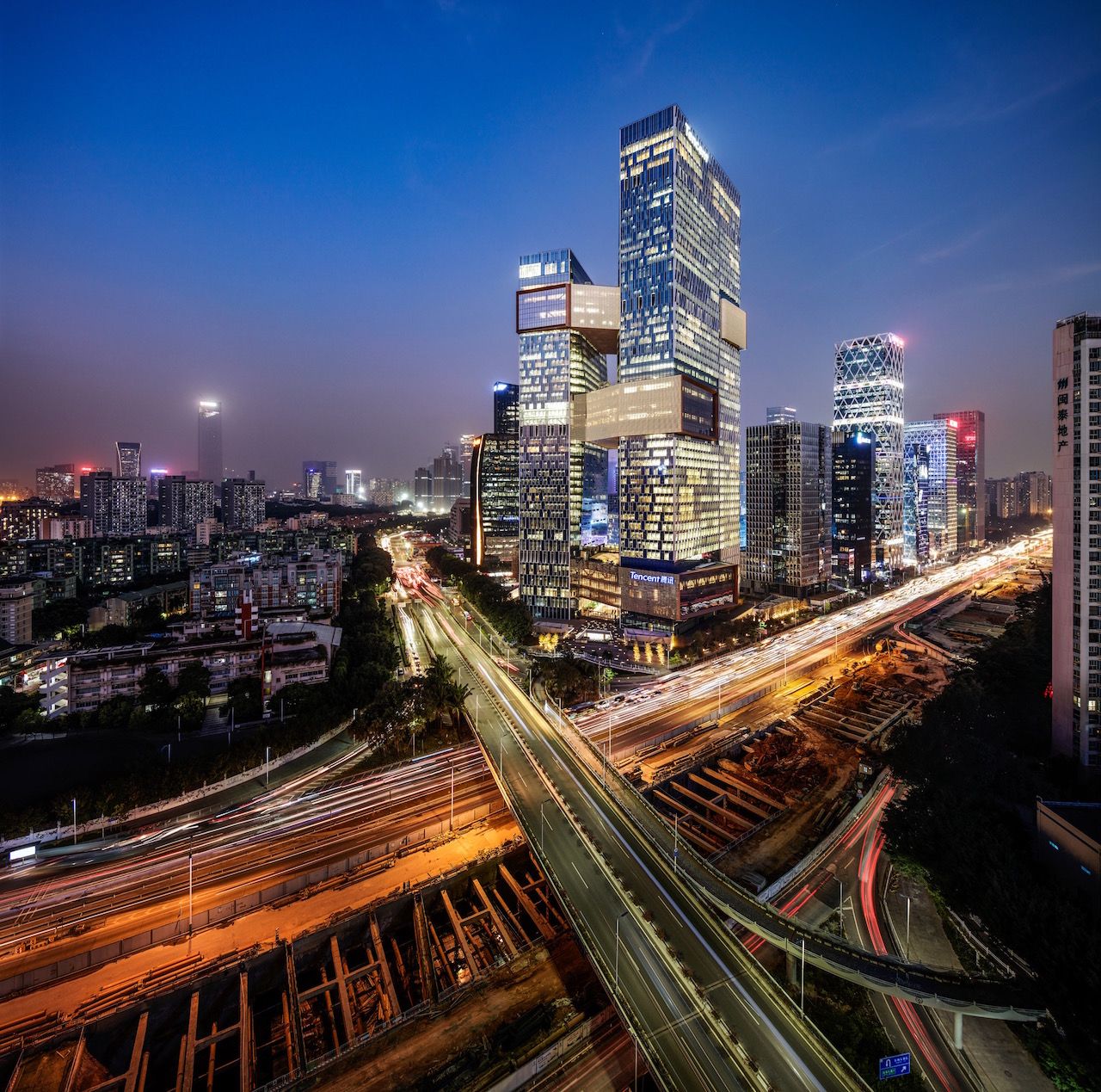
Photos of corporate buildings are a fairly routine part of corporate visual comms. More worthy of note, however, are when corporate HQ is combined with the aspirational photoshop as a design element. Consider the front cover of Tencent’s report showing its building abutting a verdant wetlands:
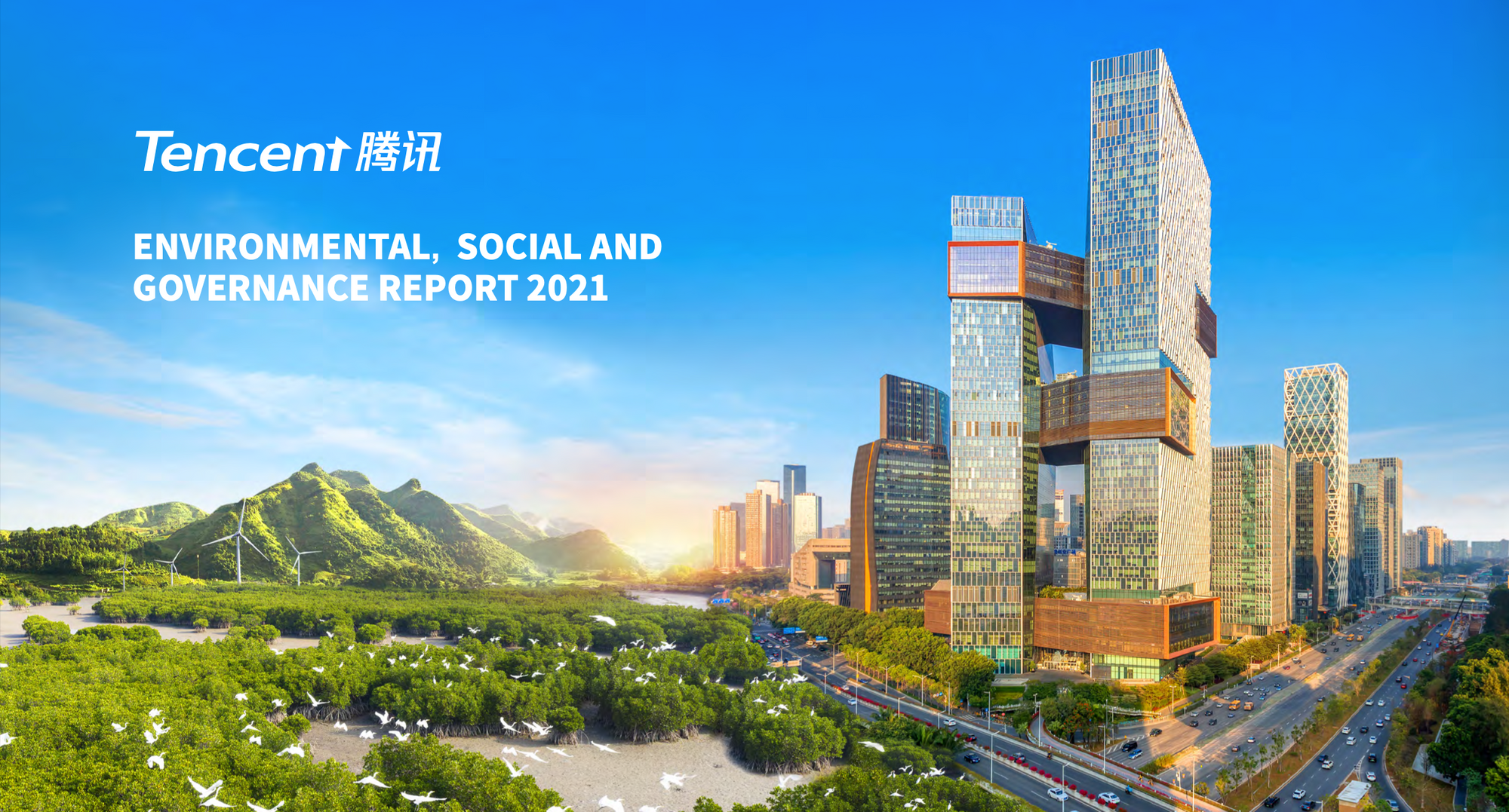
The dream of proximity to an appealing natural environment – perhaps aspiring to a certain sort of presence or care – is conveyed here, photoshop serving to quite literally connect the two. Compare that to much more prosaic reality of overlooking... a busy freeway. I would prefer the former too.
There were two standout pieces of ESG art that prompted me to write this post though, and they stand out from the rest for being a departure from the above norms. They are both just a tiny bit risky, in terms of having something approaching an actual aesthetic sensibility, or artistic aspirations. The first is this illustration of two executives from the CyberAgent ESG report:
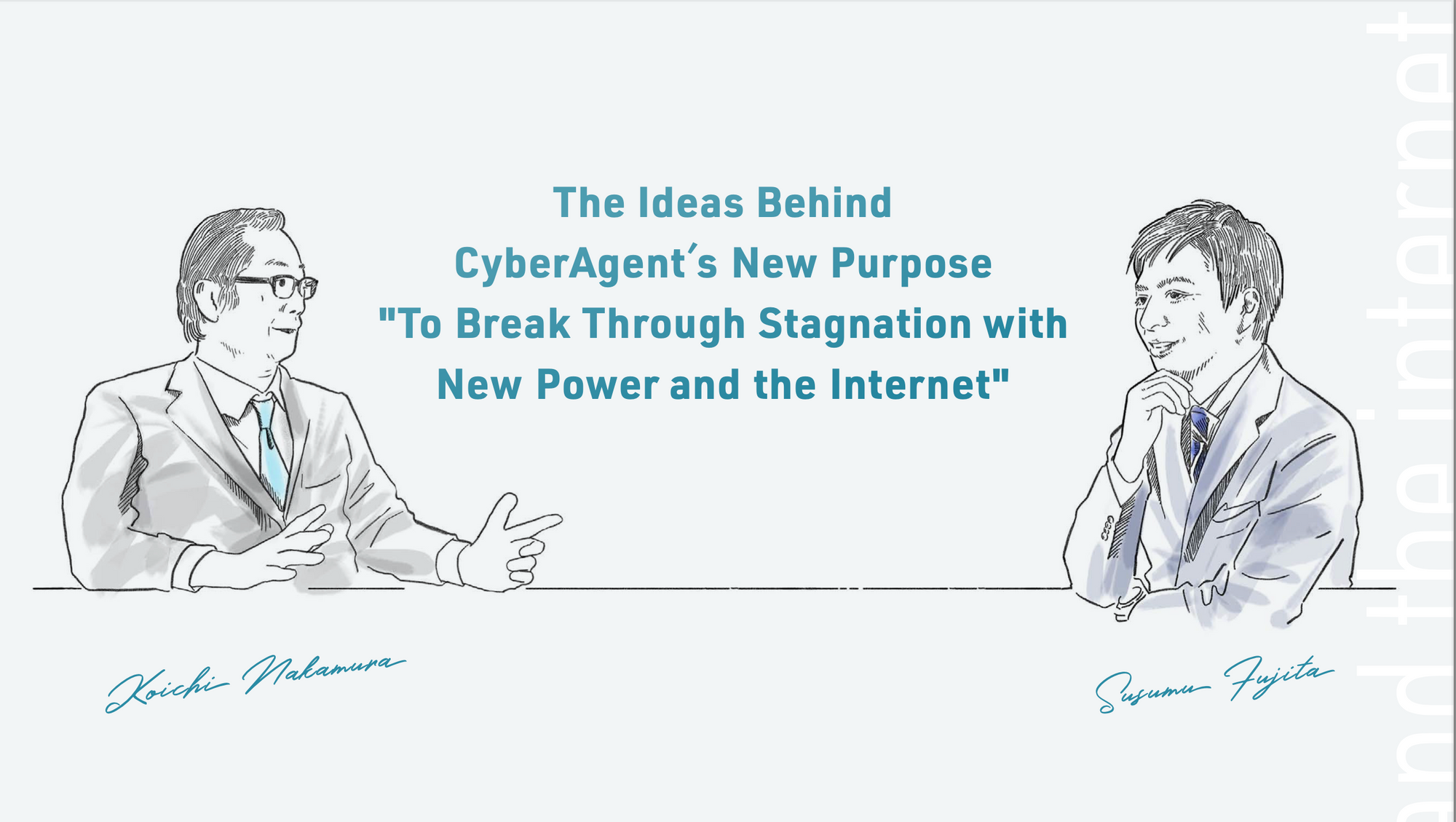
Instead of the typical photo of decision-makers, they’ve chosen to render them in a sketch, choosing the eye and hand of the artist over the technological mastery of the ubiquitous digital single-lens reflex camera. It’s still more serious than say a cartoon or anime depiction, but still not quite business-as-usual. There’s more of a warmth to, perhaps speaking of comfort with imperfection or distortion – rare for corporate comms. In the context of this newsletter, it may seem unremarkable, but among the sea of same-old, same-old images and the rote visual language of the rest of ESG art I found it arresting. I took a screenshot the moment I saw it. It was a breath of fresh air amongst the predictability. Something just a bit different. I think it’s no accident it's not piece of Western ESG art either.
A similar breeze blows through the ESG report for the Chinese media and mobile game developer 37 Interactive – not exactly thanks to any use of images (its one of the most text-heavy reports I’ve read) but for a different reason entirely. It is absolutely the only ESG document that I have ever read that quoted poetry:
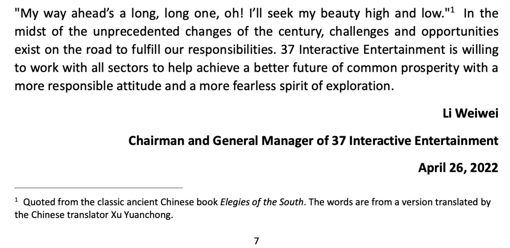
Quoting the literary canon to illustrate the corporate orientation towards responsible development is something that could only come from a non-Western corporate tradition, I think. Perhaps it’s something Western ESG officers could aspire to – though I suspect for structural reasons, they might find it tricky to. Why not though? As the same 37 Interactive report notes:

Isn’t that just an incredibly charming message? The 37Interactive ESG document has got more personality in just a few pages than just about any of the other Western ESG documents. The difference in corporate cultures is just so stark.
In a recent Keynote at EPIC People in Amsterdam, Senior Principal Engineer in User Experience & Sustainability Melissa Gregg commented that the tech industry is “in a self-congratulatory mode of progress in sustainability.” I think that’s right, though perhaps not uniformly (at least from what I see in games). There is plenty of back-patting and self-congratulations, as well as plenty of piss-taking, with some companies basically making a mockery of ESG. One observation that you’ll just have to take my word for at the moment is that it’s quite easy to tell which companies are genuine in thinking through sustainability and in taking action, and which ones are just in the self-congratulatory mode.
I hope I can share more from this research project as it progresses. ESG documents are a treasure trove for those interested in understanding corporate values, priorities, and whether or not they feel any responsibility to the wider world. Digging for art and meaning in corporate documents is pretty weird, I’ve got to admit. I am deeply fascinated by it though, and I hope it’s been interesting to see this strange little snapshot from it.
GTG is a 100% reader supported project. You can help by spreading the word on social media, to friends, colleagues or anyone you think might be interested in a sustainable games industry.