The best of corporate ESG Art in 2023


Hey before I jump into this week's post – I just wanted to let you know I have a new piece of writing out in the Cordite Poetry Review. It's a bit outside the typical outlets I write for, but it's called "How to be a digital artist in a time of climate change" and it's me thinking through some ideas about what the climate crisis does to our perceptions and practices of art-making when the world is on fire.
Any time I think about art I always go back to John Berger's incredible work 'Ways of Seeing' which for me forms the bedrock for any serious appreciation of the modern art context. Whether its photographs of Canadian or Greek wildfires or oil paintings of sailing ships on fire from the 18th Century, the process and socialisation of how we see, and the context in which we see – is so profoundly important. Berger's key insight is that there's nothign automatic about this process, it's made. Just like how Berger pointed to technologies enabling the mechanical reproduction of images (like photography) as essential to the modern regime of vision, I think knowledge of the growing catastrophe is already framing how we see.
In the piece I also talk about some of my favourite works from the recent Solar Protocol online exhibition – Solar Protocol is a website that serves up content from the server with the most abundant solar power at any given time – and what these different projects foreground through the protocol's infrastructural logic. If that sounds interesting, go check it out!
 Ben Abraham
Now, time for something a bit more fun. In keeping with the focus on art, lets talk about corporate environmental art.
Over the past few months I've been digesting this year's huge volume of game and game-adjacent ESG disclosures for the 2023 net zero snapshot (coming very soon!). In the process, I've been collecting the best (and worst) examples of ESG art in the prcess. Long time readers may remember my post on the same topic last year, and how much I enjoyed some of the more ambitious aesthetic efforts in an otherwise quite dry area.
In keeping with the art-focus, lets jump in and see who has the BEST AND WORST ESG art of twenty-twenty three!!!
Let's start with some of the better examples of – lets put this diplomatically – the most safe category of ESG art: landscape photograpy. No one's going to complain if you put a gorgeous, high res glacial lake in your environemtal reporting. Its nice, it's uncontroversial, and it speaks to the places and things that we are trying to preserve. But it is very "safe".
Few exemplify this better than Microsoft.
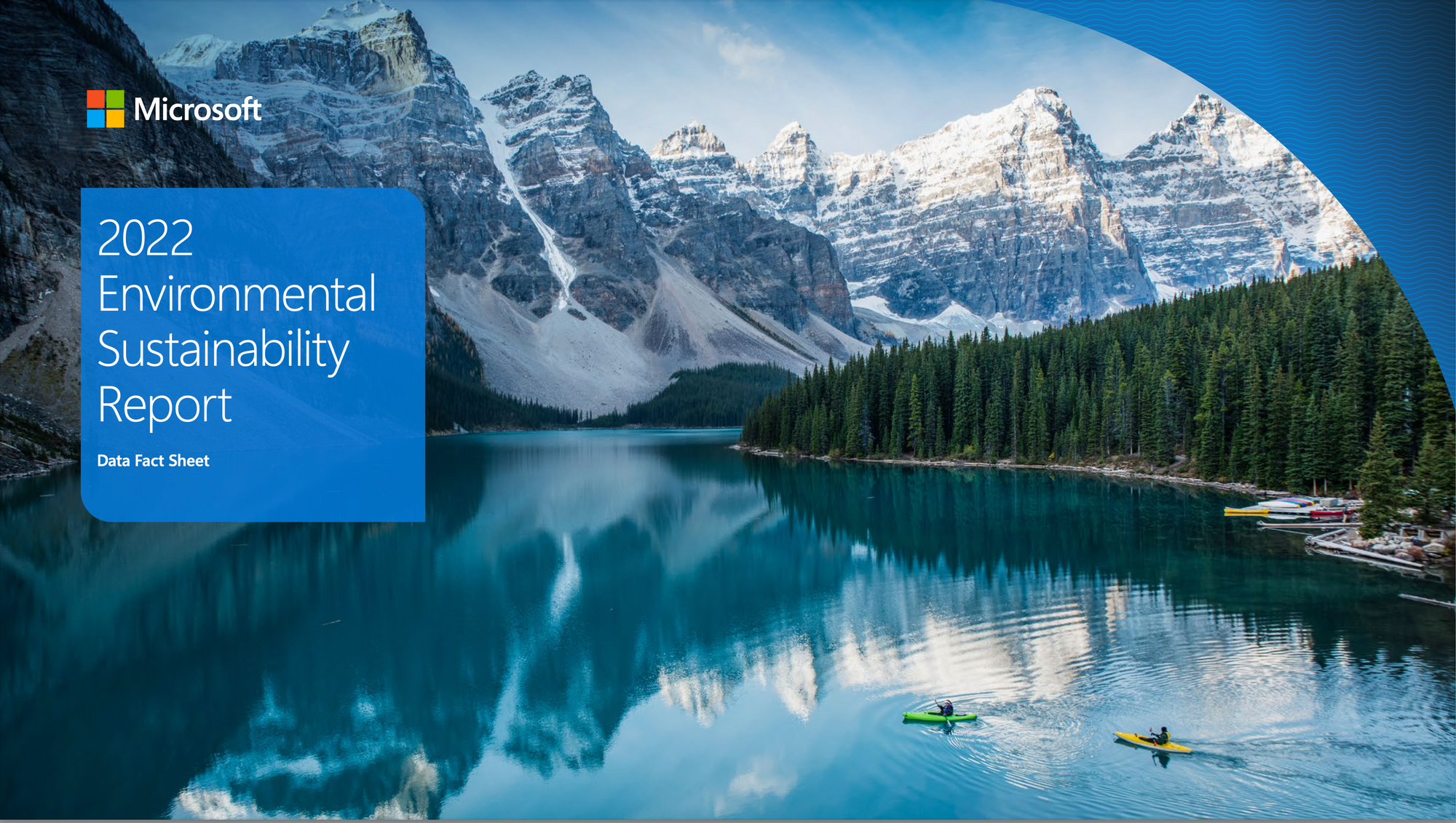
Have you seen this image before though? You could be forgiven for thinking that you have because, as nice as they are, there's a certain effect that comes from repeat exposure to these that does kind of dull the impact. Call it hedonic adaptation if you want to get really fancy about it. They just sort of blur into one. We got the one below in last year's 2021 enviro report – its pretty similar. So no paradigm shifting stuff here, despite the (I would argue) quite pardigm setting work that MS have done this year (at least in games).
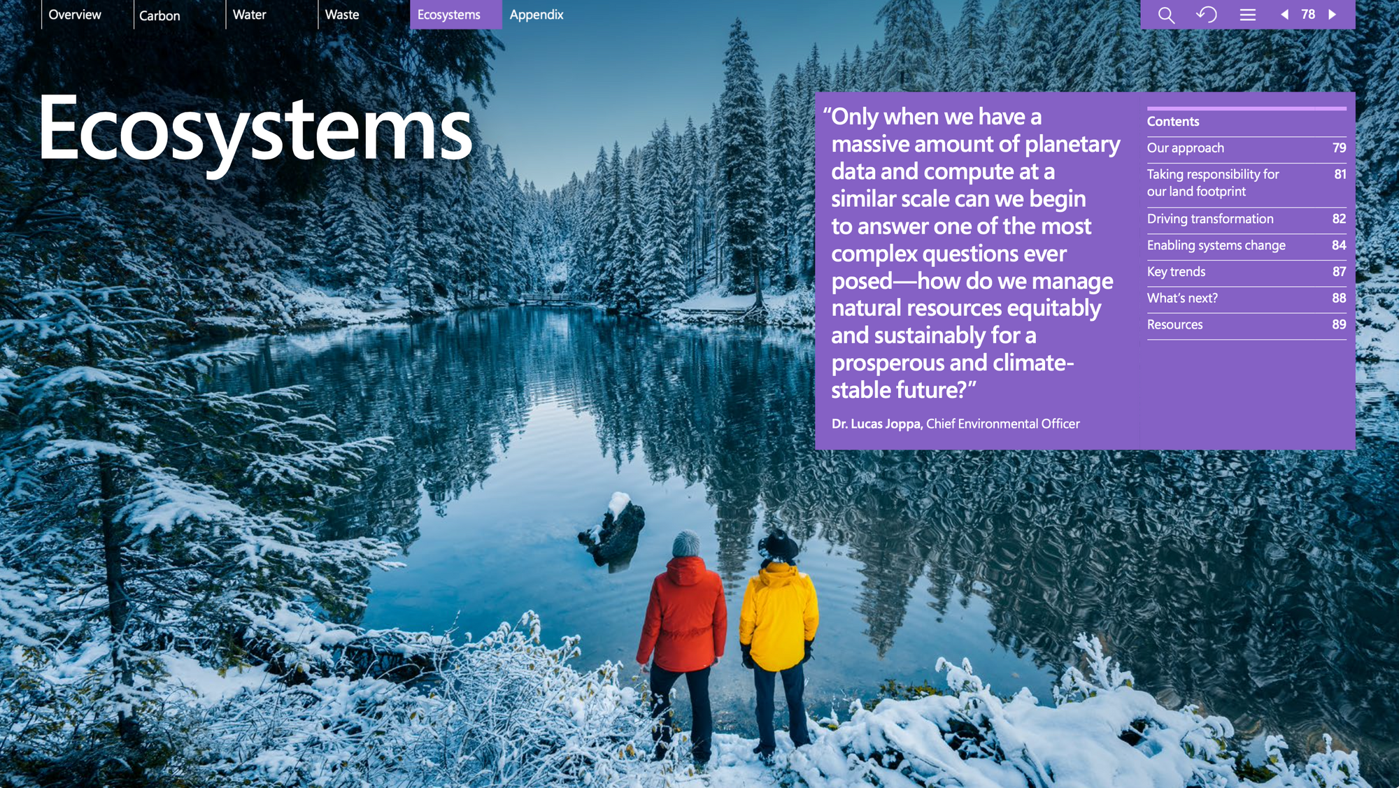
We do get some charismatic megafauna though, at least. Cute cat!
Tencent doesn't quite lean as hard into the "happy smiling faces" thing this year as it did last, but it does have a nice illustration of a rice paddy. There's something aesthetically pleasing about the neat rows, I think, even though they're a bit wobbly here. Makes me think of the cornfields in Interstellar or something.
Tencent is doing something with digitising something to do with drought resistant rice – quite important given the past year of high heat and low rain over many parts of China.
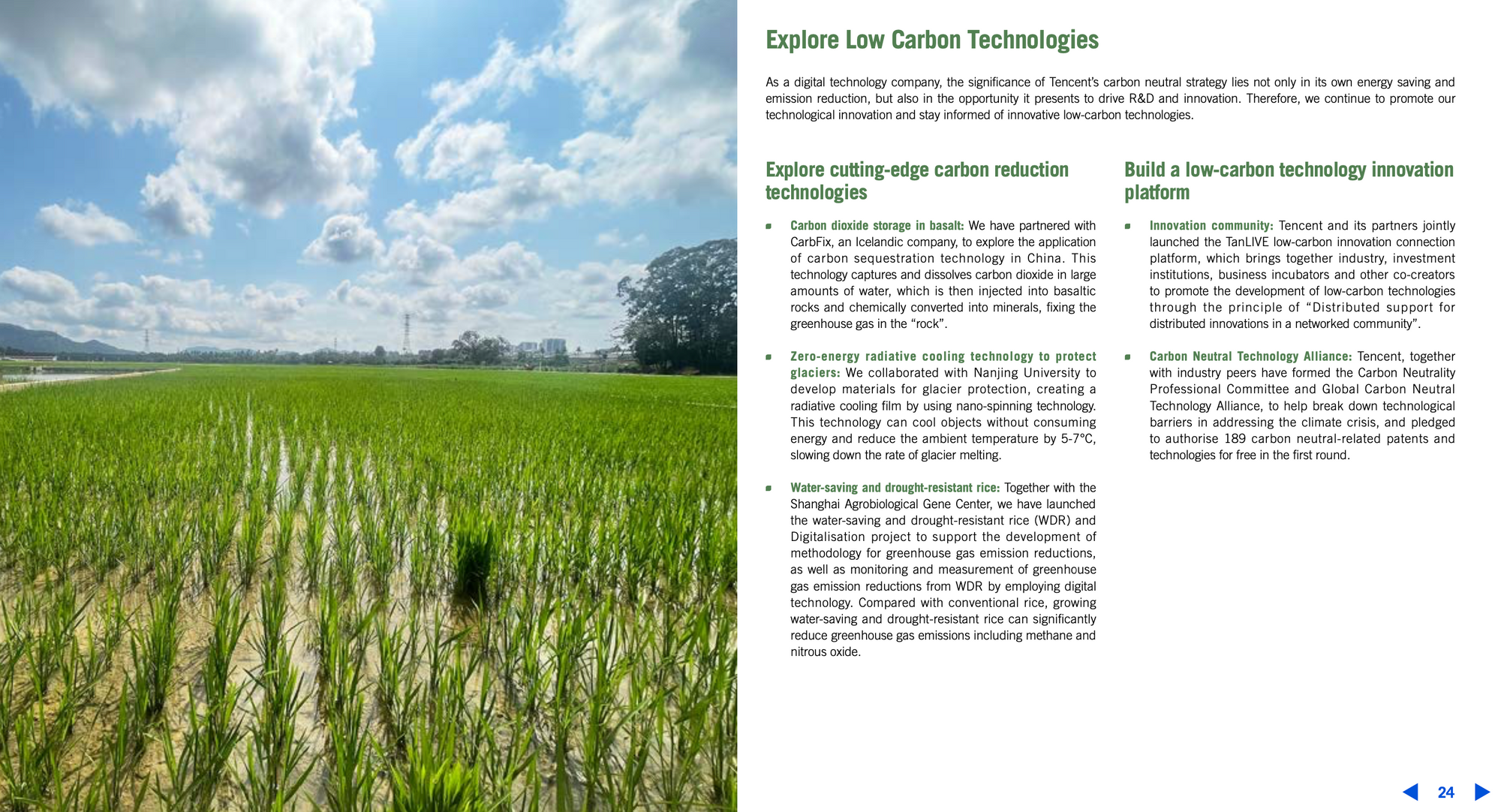
Only a half-page spread though, more pixels please next time please! Onwards!
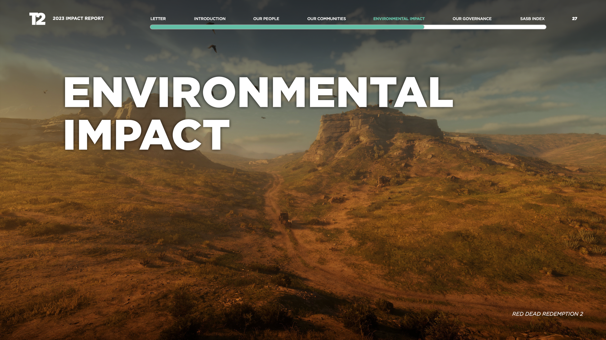
OK, there's another big game ESG art trend and, yeah you guessed it – it's videogame environments. Here's Take Two's impact report with a (gorgeous, we must admit) screenshot from RDR2. Nothing says 'Dilligent CO2 emissions Scope 1, 2 and 3 accounting' like the pristine American wilderness (digital version).
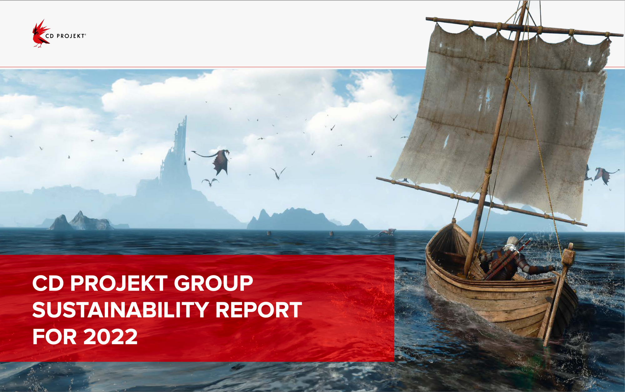
CD Projekt is (quite rightly) proud of its Witcher 3 environments and puts them front and centre – but does this cover selection suggest we're sailing into troubled waters? Is Geralt the games industry, the boat our sustainability efforts, and the swarming harpies CO2 emissions? It could be!
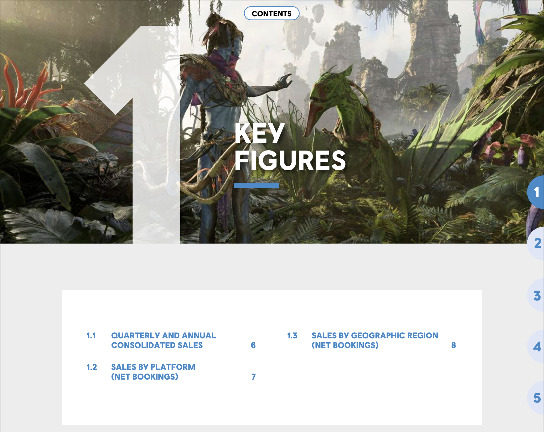
Ubisoft has a picture from the forthcoming Avatar videogane at the top of their report, which I would have put at the CSR/ESG section just personally.
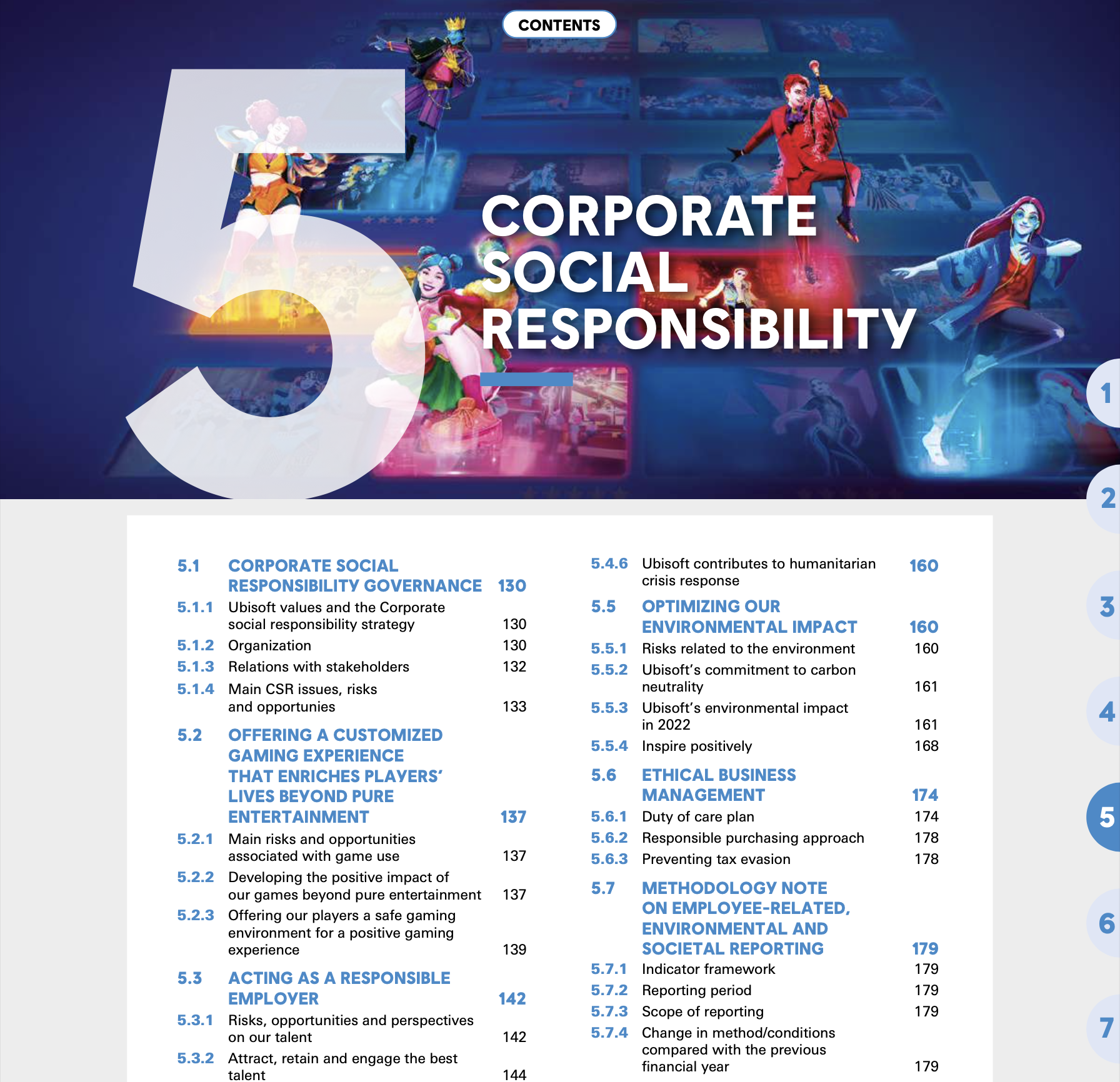
I guess the message instead is "CSR doesn't have to be boring, see it's fun actually!" You like fun, don't you? Nothing says fun like corporate social responsibility.
Check out the FINANCIAL STATEMENTS section though – nothing ambiguous about that. We're smashing through the fortifications of capital and rescuing our business objectives from opponents! Excelsior!
Alright we need to talk about visualisations and infographics, and this is kind of a serious topic. The visual presentation of information is an art. There are better and worse ways of placing information in a single image to produce a clear, comprehensible bit of communication. The effort below, from Konami, to condense the different areas of their TCFD risk analysis... could be better.
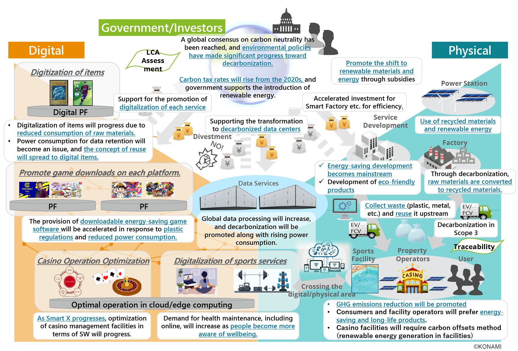
Getting an actual illustrator or graphic designer involved, and not relying on what looks like Powerpoint would be a great place to start in making things more legible to important stakeholders. Just a tip! I don't actually hate the idea of illustrating how each topic is linked, but there's got to be a better way.
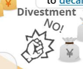
As an aside, this detail from the above image is tied for my favourite little detail of any ESG art this year. Divestment? NO! 🥊
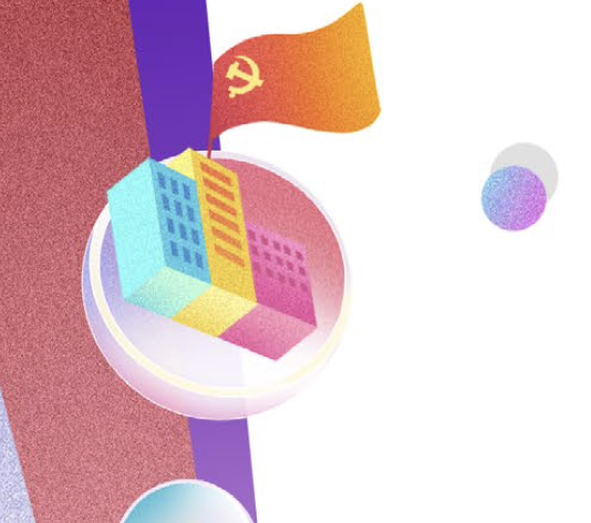
The other one? It's this tiny little communist part HQ from a certain Chinese ESG report.
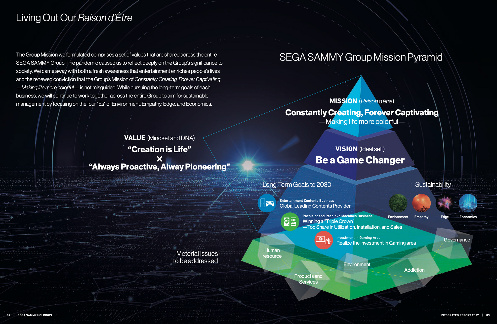
Here's a visualisation that's at least palatable, if still somewhat equally inscrutable – it's the SEGA Sammy group's "Mission Pyramid"!
What about a timeline to carbon neutrality (碳中和路径) stretching across the wide open horizon, dotted with windfarms and verdant green fields?
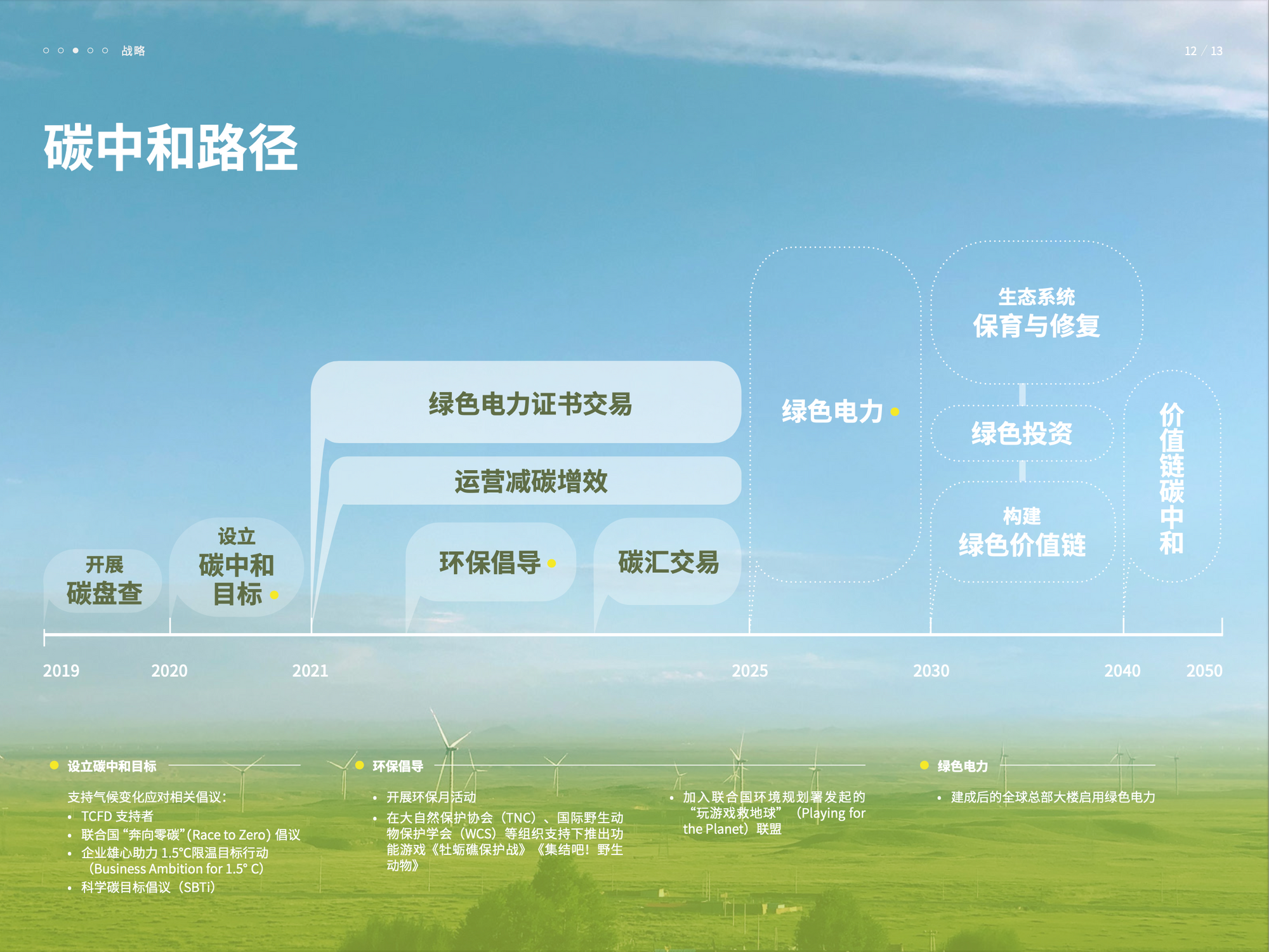
That's from 37 Interactive's annual TCFD disclosure – which seems to have only been released in Mandarin. With the help of some good translation programs I've deciphered much of their CSR reporting this year, but its slow going. There's a couple like that which have taken some real digging to get hold of, but they have been very much worth reading.
I'm consistently impressed by the Chinese corporate reporting I come across, and, above all, their focus on aesthetically attractive reports. It counts!

That's from the contents page of 37i's annual ESG report (which is in addition to its detailed TCFD risk report). Who else is putting in this level of effort to zhuzh up their reports? Perfect World – that's who!

Picking up the poetic batton from 37i last year, PerfectWorld CEO Chi Yufeng's message on ESG signs off with some quite poetic phrasing, coming through even via translation software. Framing his message within the context of increasing extreme weather, Chi opens his final paragraph with the following hopeful lines:
草木蔓发,春山可望。
The vegetation is spreading, and spring mountains are in sight.
That's my kind of attitude – especially from a business with such an ambitious net zero target (2025!) and solid progress towards it. More of this please.
Okay, one last thing before we finish. It wouldn't be the annual ESG art post without a winner of a brand new award we're handing out for Best ESG Art Pose. There were lots of contenders, lots of the same contenders as last year. Difficult judging criteria, huge amount of work, want to thank all who entered, etc etc.
Runner up is once again Mixi president Koki Kimura – who was (I'm going to say) retroactively our winer in 2022, despite stiff competition from the nordics.
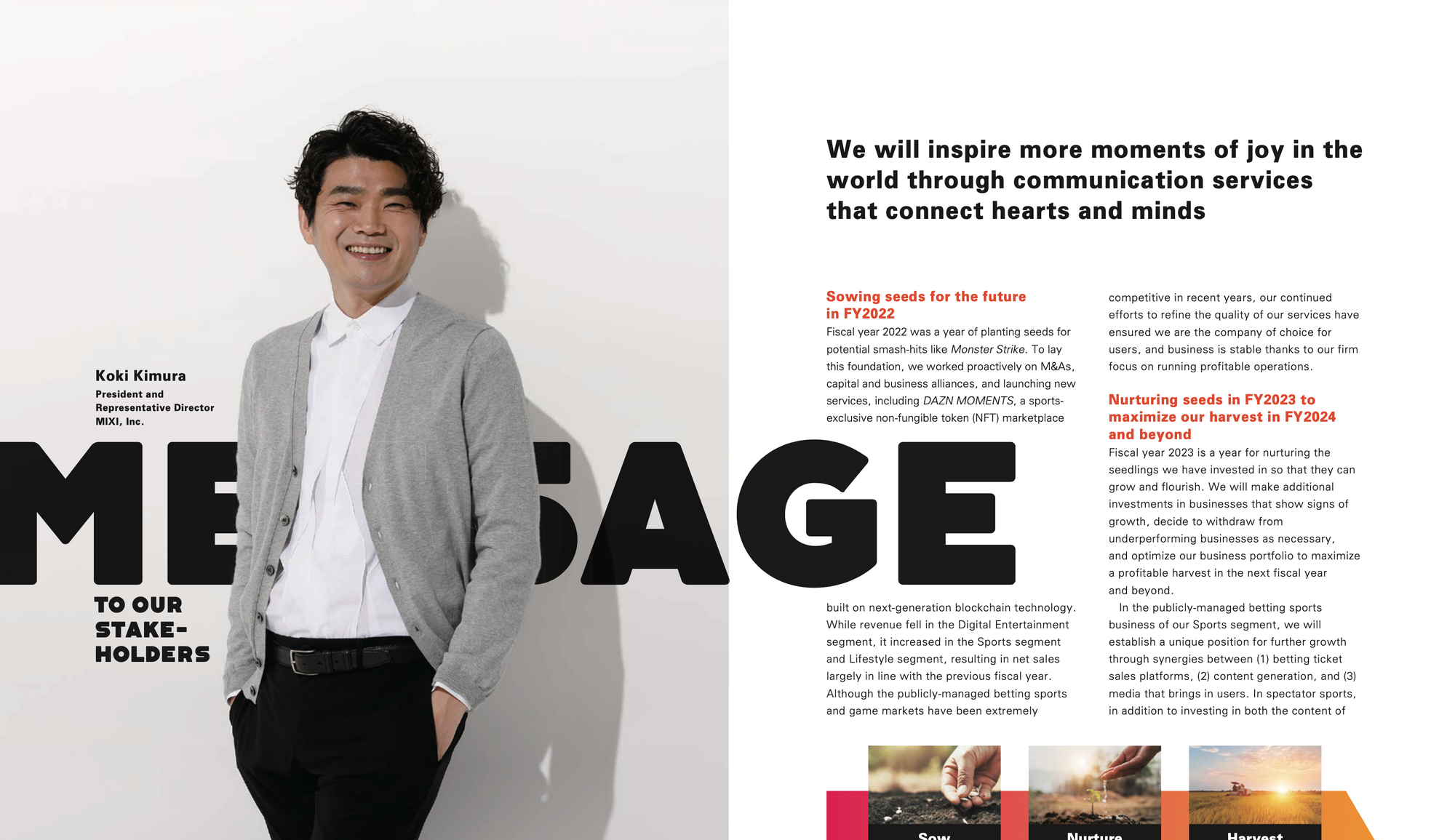
It's close again this year, but that doesn't quite rise to the same level as last year's winning pose. Also, perhaps a little less relaxation might be in order, given the state of Mixi's current ESG disclosures (the less about which is said, the better!! 😬).
Instead, this year our winner of AFTERCLIMATE's BEST ESG ART POSE TWENTY-TWENTY THREE is CyberAgent CEO Susumu Fujita! 👏👏👏 Congratulations Fujita-san!!
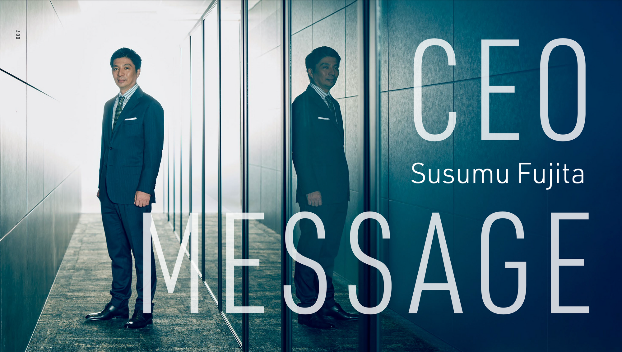
It's not just blend of casual nonchalance and seriousness that does it, it's the choice of scenery, the dark reflection in the glass. Perhaps he's pondering the potentially HIGH financial impact of "service disruptions caused by flooding, power conservation, and power outages" that were identified in the CyberAgency TCFD risk exercise this year? Or maybe he's relaxed because he's pondering the LOW financial impact (projected!) by increased regulations and potential carbon tax burdens? They have the answers, after all! They're planning to "Consider energy-saving measures in the workplace, and switch to renewable energy sources, etc."
Here's hoping that consideration doesn't take too long though, last month Typhoon Lan took out power to an estimated 90,000 homes in western Japan. I found that in about 10 seconds of searching – that's how easy it is to come up with extreme weather events these days.
I'm sure it'll be fine.